Displaying Plotly Charts in Hugo Blox
Plotly is a powerful visualization library for creating interactive charts and graphs. Integrating Plotly charts into your Hugo Blox website allows you to present complex data in an engaging and interactive way, enhancing user experience and content quality. This guide explains how to create and display Plotly charts in Hugo Blox.
What is Plotly?
Plotly is a popular data visualization library that supports a wide range of chart types, including line charts, bar charts, scatter plots, and heatmaps. Its interactivity—such as zooming, hovering, and toggling data series—makes it ideal for creating dynamic, user-friendly visualizations.
Key Features
- Interactivity: Users can explore data by zooming, hovering, and toggling elements.
- Customization: Adjust colors, labels, axes, and more to match your website’s style.
- Versatility: Supports a variety of chart types for different use cases.
How to Embed Plotly Charts in Hugo Blox
Hugo Blox makes it easy to embed Plotly charts directly into your Markdown files. Follow these steps to integrate Plotly charts into your site:
Create and Export Your Plotly Chart
- Use Python or JavaScript to create your Plotly chart.
- Export the chart as a JSON file containing its configuration and data.
Embed the Chart in Hugo Blox
Save your Plotly JSON in your page folder, for example chart.json, and then use the Hugo Blox plotly shortcode to embed your chart:
{{< chart data="chart" >}}
This shortcode links to the JSON file and renders the chart on your page. For more details, refer to the Hugo Blox Docs.
Interactive Features
Once embedded, the chart becomes fully interactive. Users can:
- Hover over data points for details.
- Zoom in on specific sections.
- Toggle data series on and off.
Customize Your Chart
Plotly allows extensive customization to match your website’s branding. Adjust colors, labels, axes, and other elements to create visually cohesive charts.
Use Cases for Plotly Charts
Plotly charts are versatile and can enhance various types of content on your Hugo Blox website. Here are some examples:
Data-Driven Blog Posts
Support your articles with interactive visualizations to help readers explore trends, research findings, or other data.
Educational Content
Use Plotly charts in tutorials or courses to demonstrate concepts, visualize results, or show changes over time. Interactivity helps learners engage with the material.
Business and Financial Analysis
Present financial reports, market trends, or other business data in a clear and accessible way, making it easier for your audience to grasp key insights.
Research Presentations
Embed interactive charts in research articles to visually communicate findings. Interactivity provides additional layers of insight compared to static images.
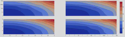
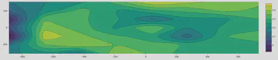
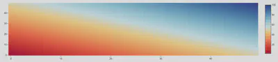
Example Plotly Chart Images
The website Plotly JSON Editor offers some examples of Plotly charts that you can select from the drop down menu. Here are some example images of Plotly charts taken from that site that are relevant to my area of research that you can embed in your Hugo Blox website:
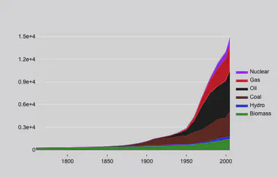
Line Chart
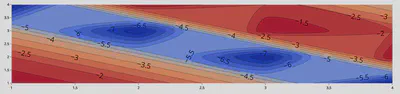
Contour Plot with Labels
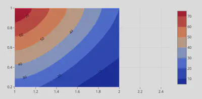
Contour Plot with Legend and Color Axis
Contour Plot with No Lines
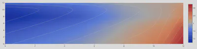
Contour Plot with Nonlinear Interpolation
Contour Plot with Custom Color Scale
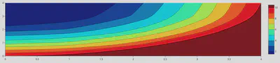
Contour Plot with Custom Color Scale and Color Bar
Contour Plot with Custom Color Scale and Color Bar 2
2D Line Plot with 2 Traces

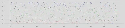
2D Scatter Plot
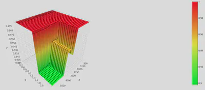
3D Contour Plot with Lines
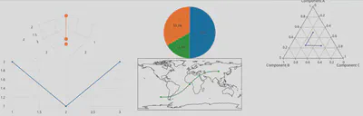
Multiple Plot Types
Why Use Plotly Charts in Hugo Blox?
Adding Plotly charts to your Hugo Blox website enhances both the quality and engagement of your content. Here’s why:
Python Library Integration
If you’re already using Python for data analysis, Plotly provides a seamless way to visualize your results.
Improved Engagement
Interactive charts encourage users to spend more time exploring your data.
Better Data Comprehension
Visualizing complex datasets makes them easier to understand for a broader audience.
Professional Presentation
Plotly’s polished design adds credibility and a professional touch to your website.